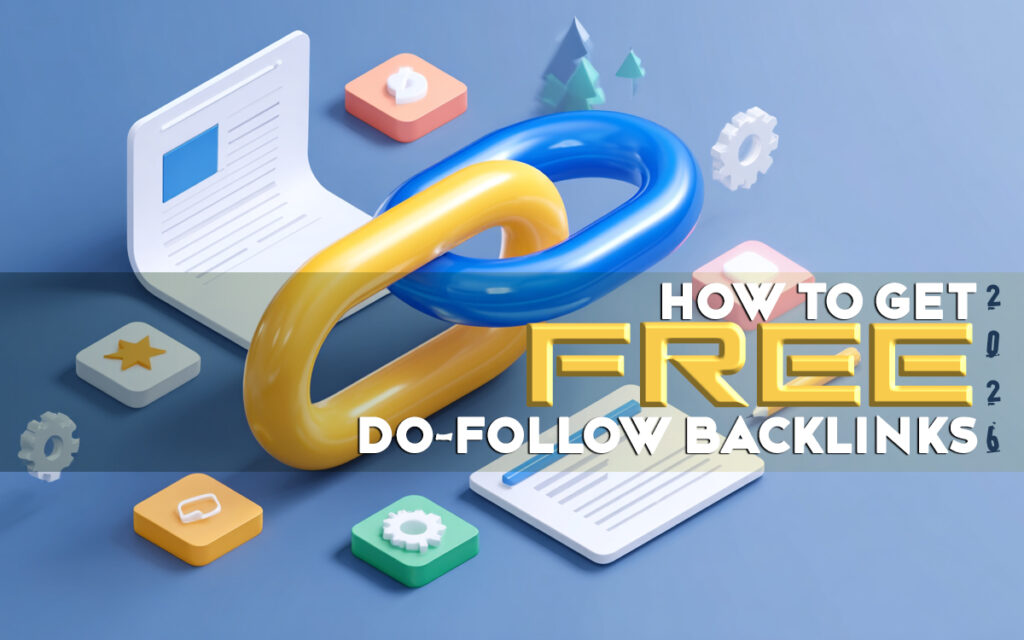
Getting a 70% reply rate on cold outreach is possible. Here’s exactly how to design, write and send a PRO level outreach email that makes people respond.

Cold outreach has one job – Get a reply.
Not a maybe, not a “thanks but no thanks”. A real, interested reply from someone who actually wants to move forward.
Most people never get there – not because outreach doesn’t work, but because they’re doing it wrong from the first line. This guide covers everything: why most emails fail, what a PRO level email actually looks like, and how to build one that gets results.
What a PRO Level Outreach Email Actually Looks Like
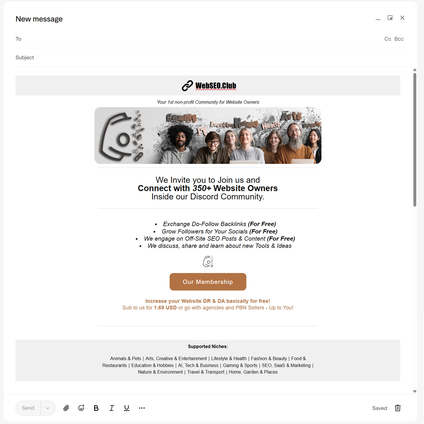
Short, sharp, straight to the point, with a single image that does the heavy lifting.
This is the difference between an email that gets read and one that gets deleted. Branded header, a strong visual, short and specific content, one clear call to action, and a footer that tells them exactly who you are and what you cover. Everything has a purpose. Nothing is there to fill space.
Complete Email Design Breakdown
Every section of a PRO level outreach email has a job. Nothing is decorative. Here’s what each part does, how we approached it, and how you can adapt it to your own outreach.
The Header
Your Brand’s First Impression
The header is your handshake. Before the reader processes a single word of your email, they’ve already made a judgment based on what they see at the top. A clean, branded header tells them this came from a real person or organization that takes themselves seriously. It removes the first and most important doubt – is this spam or is this legit. Without it, your email starts from zero credibility. With it, you’ve already earned the next five seconds.
What we did: Clean, centered logo with the site name. One line underneath – “Your 1st non-profit Community for Website Owners”. Nothing else. Instant brand recognition before a single word of content is read.
How you might approach it:
An e-commerce brand leads with their logo and a seasonal tagline. A SaaS product uses their product name and a one-liner on what it solves. A local service business puts their name, city, and what they do. An agency leads with the agency name and their core offering. The format stays the same across all of them — one look, instant clarity. What changes is the identity behind it.
The Visual
Give Them Something to Look At
People don’t read emails – they scan them. A strong visual is the pattern interrupt that stops the scan and pulls them in. It doesn’t need to be elaborate, but it needs to be intentional. A well-chosen image communicates tone, context, and personality faster than any paragraph of text ever could. It’s also the element that makes your email feel like something worth reading rather than something to get through.
What we did: A wide banner image showing real people across different niches – Gaming, IT, Health, Arts. It communicates community, diversity, and real humans immediately without saying a word.
How you might approach it:
A software tool might show a clean product UI screenshot. An e-commerce store might use a lifestyle photo of their product in use. A service-based business might use a before/after result or a team photo. A directory or community might show the breadth of who they serve. Whatever you choose, it needs to reflect what you actually do, not just fill the space.
The Headline
Your Opening Argument
If the header earns you five seconds, the headline earns you the rest of the email. It’s your value proposition stripped down to its most essential form — one or two lines that tell the reader exactly what this is about and why it matters to them. A weak headline makes everything below it irrelevant. A strong one makes them want to keep reading even before they fully understand the offer.
What we did: “We Invite You to Join Us and Connect with 350+ Website Owners Inside our Discord Community.” Clear invite, specific number, specific platform. No ambiguity.
How you might approach it:
A SaaS founder reaching out for a partnership leads with the outcome “Get your audience access to [Tool] at zero cost.” An e-commerce store proposing a collab leads with reach – “We sell to 12,000 buyers in your niche every month”. A service agency leads with credibility “We’ve generated 400+ backlinks for clients in your space”. Lead with what matters to them, not what matters to you.
The Body
Short, Specific and Scannable
This is where most outreach emails fall apart. People over-explain, over-sell, and over-write. The body has one job – communicate the offer clearly enough that the reader can make a decision. Bullet points over paragraphs. One idea per line. Every sentence either adds value or gets cut. The moment someone has to re-read something to understand it, you’ve already lost them.
What we did: Four bullet points, each delivering one clear value. Exchange backlinks, grow socials, engage on off-page content, share tools and ideas — all free. Scannable in under ten seconds.
How you might approach it:
Three to five bullets, each answering “what do I get.” A SaaS product lists key features only relevant to the person they’re contacting. An agency lists results, not services. An e-commerce brand lists what the partnership looks like – revenue share, product gifting, audience size. Strip everything back to what’s directly relevant to that specific reader. If a bullet doesn’t apply to them, cut it.
The CTA Button
One Action, One Direction
Every email needs to end somewhere. The CTA is that destination – the one thing you’re asking the reader to do. Not two things, not three – ONE clear, specific, well labeled button removes the friction between interest and action. When someone finishes reading and thinks “okay, I’m in” – the button needs to be right there, obvious, and easy to click. Anything that makes them search for next steps loses them at the finish line.
What we did: One branded button – “Our Membership.” One destination. Centered, impossible to miss, consistent with the email’s color palette.
How you might approach it:
A SaaS company sends them to a free trial or a partnership page. An agency sends them to a case study or a booking link. An e-commerce brand sends them to a collab application or a product page. A community sends them to a membership or signup page. The label should always reflect the destination – “Book a 15-Minute Call”, “View Our Case Studies”, “See the Partnership Details.” Never generic, always specific.
The Value Hook
Why You and Not Someone Else
This is the line that does the heavy lifting. By this point in the email the reader knows what you’re offering – the value hook is what makes them choose you over doing nothing, going elsewhere, or just closing the tab. It’s not a feature. It’s a reason. A price comparison, a result, a unique angle, a credibility signal. One sharp line that tips the scale from interested to convinced.
What we did: “Increase your Website DR & DA basically for free. Sub to us for $1.69 USD or go with agencies and PBN sellers — up to you.” Direct comparison, real price, zero pressure. The reader does the math themselves.
How you might approach it:
An agency might compare their pricing to hiring in-house. A SaaS tool might highlight what the alternative costs. An e-commerce brand might reference their conversion rate or average order value. A community might contrast their model against paid platforms. Whatever you sell – find the one number, comparison, or fact that makes the offer feel like a no-brainer. That’s your value hook.
The Footer
Context and Credibility
The footer is the last thing they see before closing the email. Most people treat it as an afterthought, a blank space with an unsubscribe link buried at the bottom. That’s a missed opportunity.
A well-built footer does several things at once. It surfaces your most important links: your social profiles, key pages, resources, or community spaces. It adds a layer of legal credibility with a privacy policy and unsubscribe option. And it gives the reader somewhere to go if the email itself didn’t fully convince them.
Think of it as a mini version of your website’s navigation. Someone who’s on the fence about replying might click through to your LinkedIn, your portfolio, or your about page – and that’s what tips them. Without a footer, that path doesn’t exist.
It also signals that you’re organized and established. Anyone can write an email. Not everyone has a branded, structured communication that holds up from the first pixel to the last.
How to Create a Professional Email Design
Writing a great email is half the job. How it looks when it lands is the other half. A well-designed email template is something you build once and reuse every time — your branding locked in, your structure set, your footer ready. No rebuilding from scratch, no inconsistency, no plain text emails going out when they shouldn’t.
Building the Template
For the actual build, we use and recommend RGE Studio – formerly known as Beefree, now part of the Really Good Emails complete system. It’s a drag-and-drop email builder that requires zero coding knowledge. You pick a structure, drop in your content blocks, add your branding, and your template is done. No developer needed, no HTML written from scratch.
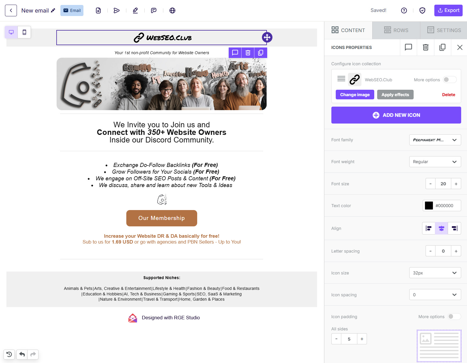
What makes it the right tool for this:
- Free plan available – enough to build and export a solid template without paying anything
- Starting templates – you’re not building from a blank canvas
- Brand style settings – lock in your logo, colors, and fonts once so every email stays consistent
- Reusable content blocks – build your header and footer once, reuse them across every email
- Mobile optimization built in – every template renders correctly on any screen size
Build your full email structure inside RGE Studio – header, visual, headline, body, CTA, value hook, footer — then export it when it’s ready.
Transfer Your Template to Your Email – Easy Copy and Paste HTML Transfer
Once your design is ready in RGE Studio, exporting it takes one click. Hit Export in the top right corner and select HTML. That downloads your template as a clean HTML file. From there, how you use it depends on your email client or sending platform:
Gmail / Outlook / Apple Mail Paste the raw HTML directly into your compose window. In Gmail, open a new message, click the three-dot menu at the bottom, select Paste as HTML and drop your code in. Outlook users can use the Insert as HTML option. The email renders exactly as designed – header, images, footer and all.
Email Marketing Platforms If you’re sending through Mailchimp, HubSpot, Klaviyo, or any similar platform – RGE Studio connects to most of them directly. Hit Export, select your platform from the integrations list, and it pushes the design over in one click. No manual HTML handling required.
For everything else Copy your HTML code and head to W3Schools HTML Editor. Click Try It Yourself, paste your HTML into the left panel, and the right panel instantly renders the visual of your email exactly as it will look. From there, select all the content on the right, copy it, and paste it directly into your email compose window.
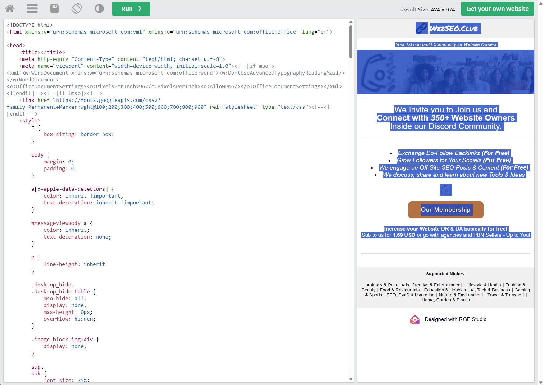
Clean, free and no account needed.
It also lets you edit the raw HTML directly – remove any extra code, tweak anything that doesn’t look right, or strip out the RGE Studio badge that appears in the footer on free plan exports. All before a single email gets sent.
Email Subject Line – Your Email’s First Impression
Your subject line decides whether the email gets opened or ignored. Everything else you’ve built – the design, the copy, the offer, is irrelevant if nobody clicks.
Keep it direct and specific. Tell them exactly what’s inside without trying to be clever. Personalization helps, even one specific detail separates your email from the mass blasts sitting next to it in their inbox.
A few quick rules:
- Under 50 characters – anything longer gets cut on mobile
- No clickbait – it damages trust before the email even opens
- No ALL CAPS, no excessive punctuation – instant spam signal
- Test few versions – small differences in subject lines produce big differences in open rates
Subject lines deserve their own deep dive. We cover the full breakdown – formats, examples, what works by niche and purpose – in our Email Subject Line Guide (coming soon).
Before You Hit Send – Final Checks That Matter
The template is done. The copy is right. Before you send anything, run through these quickly:
- Profile photo set – real face, not a logo, not a default avatar
- Sender name – your actual name, not a brand handle
- Custom domain email –
you@yourdomain.comnot a free email address - All links work – click every single one before sending
- Images are hosted – not embedded locally, or they won’t load
- Unsubscribe option in the footer – legally required in most countries
- Send a test email to yourself first – always. Check it on mobile too.
One bad send to a cold list is hard to recover from. Thirty seconds of checking saves the whole campaign.
Target sites that match your DR range. Not dramatically above it, not below it. Exchanges feel fair when the value is roughly equal. That fairness is what makes people say yes.
Niche match matters just as much. A backlink from a site in your space carries real SEO value. One from a completely unrelated niche carries almost none — and it looks unnatural to Google.
If you’re still building your outreach list, the WebSEO Club public directory is a free, manually reviewed list of websites actively open for backlink exchange. Filterable by DR and niche, so you’re not fishing blind.
Why Most Outreach Emails Fail Immediately
Your email lands in a stranger’s inbox. They don’t know you. They didn’t ask to hear from you. And they’re looking for any reason to close it and move on.
Most outreach emails hand them that reason immediately.
The core problem is perspective. Most people write from their own point of view – what they need, what they’re offering, why this is great for them. The reader doesn’t care about any of that in the first three seconds.
They care about three things:
- Does this look real or is it spam?
- Is this relevant to me?
- Is this going to waste my time?
If your email doesn’t answer all three fast, it’s gone.
Here’s what that looks like in practice: Three real patterns – you’ll recognize all of them.
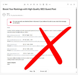
Example 1:
Link Spam This email never reaches the inbox. Multiple unknown external links, a bulk sales pitch, and zero personalization trigger spam filters instantly. And even if it lands – nobody is buying backlinks from a cold email full of URLs they’ve never heard of.
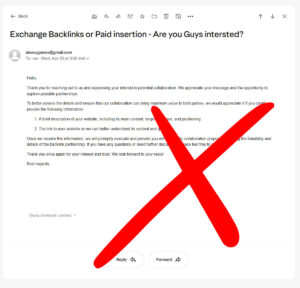
Example 2:
Misleading and Confusing This one opens with “Hello, thank you for reaching out to us” – to someone who never reached out. No explanation of what’s being offered, no clear proposal, and then asks you to explain your own business so they can figure out how to help you. The reader’s job is not to do the sender’s homework for them.
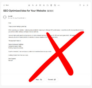
Example 3:
Solid Effort, Poor Presentation The structure is there. The intent is clear. But no header, no signature, no profile image, no visual identity whatsoever. It reads like a draft. In a competitive inbox, a plain text email from an unknown sender with nothing to anchor trust gets skipped – even when the content is right.
Final Tip:
Volume vs Quality – 10 Good Emails Beat 100 Bad Ones
Cold outreach is not a numbers game. It’s a quality game that most people play wrong.
Sending 100 generic emails to random inboxes produces noise. Sending 10 well-researched, well-designed, well-targeted emails to the right people produces replies. The math isn’t even close – generic outreach converts at 1 to 5%. Targeted, relevant outreach to the right contacts pushes that up to 70%.
Build your list carefully. Know who you’re contacting and why. Have your template ready, your content prepared, and your follow-up planned before you send the first email.
One good reply is worth more than a hundred non-responses. Treat every email like it represents you – because it does.